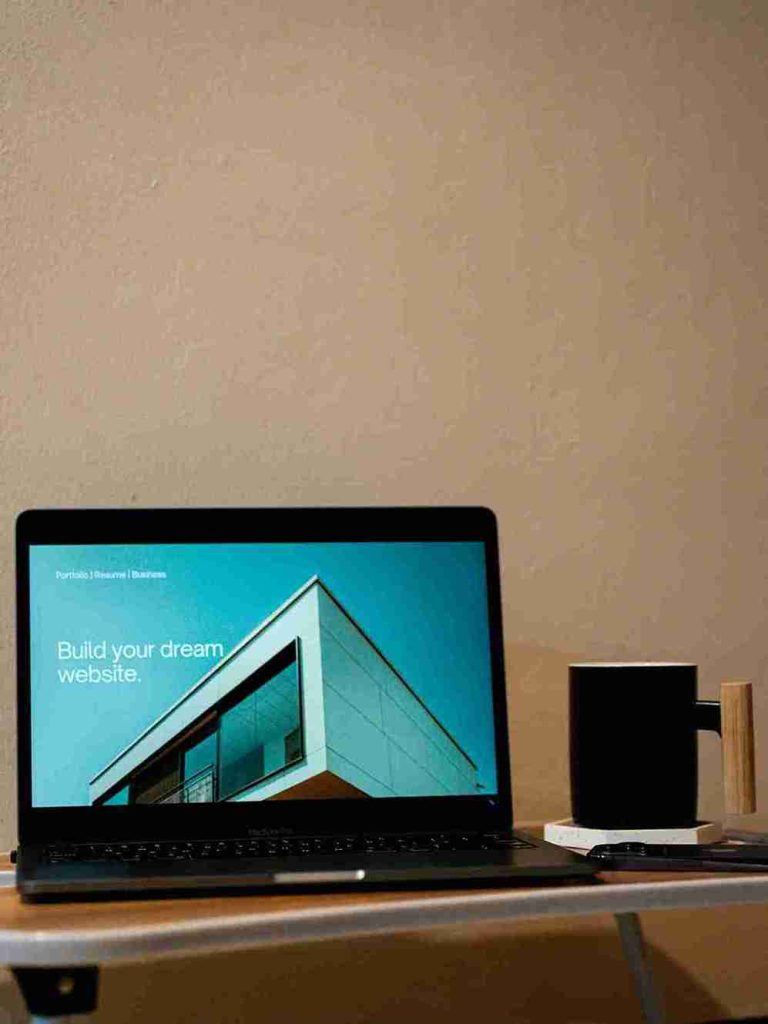

Web Design in Pretoria
In web design in Pretoria, “CMS” stands for “Content Management System,” which is a software application that allows users to create, edit, manage, and publish digital content on a website without needing extensive technical knowledge, essentially providing a user-friendly interface to build and update website content easily.
Key points about CMS:
- Functionality: Users can add text, images, videos, and other elements to their website through a dashboard, often without writing code directly.
- Collaboration: Multiple users can contribute to content creation and editing with different permission levels.
- Database storage: Content is stored in a database, enabling easy retrieval and updates.
- Popular CMS platforms: WordPress, Joomla, Drupal.
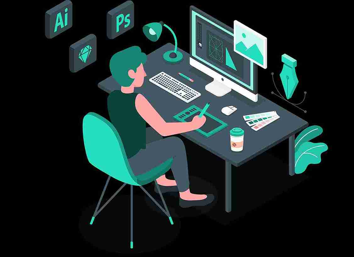
Difference between Website Design and Website Development:
Website design focuses on the visual appearance and user experience of a website, including colours, layout, and fonts, while website development focuses on the technical aspects of building the site, using code to create its functionality and structure, essentially turning the design into a working website; in simple terms, design is “look and feel” and development is “how it functions.”.
Key points about website design:

- Focus on aesthetics: Primarily concerned with the visual appeal of the website, including color schemes, typography, and imagery.
- User experience (UX): Aims to create a user-friendly interface that is easy to navigate and interact with.
- Tools used: Graphic design software like Adobe Photoshop, Figma, and Sketch.
Web Design Pretoria
Key points about website development:
- Coding and programming:
Uses coding languages like HTML, CSS, and JavaScript to build the website’s structure and functionality.
- Front-end and back-end:
Can involve both front-end development (what the user sees) and back-end development (database management and server-side logic).
- Technical expertise:
Requires a deeper understanding of programming languages and web technologies.
Let us look at Wordpress as the most popular cms
WordPress website development involves creating, customizing, and maintaining websites using the WordPress content management system (CMS). WordPress is a popular platform known for its flexibility, user-friendliness, and extensive ecosystem of themes, plugins, and tools.
Here’s an overview of what WordPress website development typically entails:
- Installation and Setup: The first step in WordPress website development is installing WordPress on a web server. This can be done manually or through one-click installation tools provided by web hosting companies. After installation, basic configuration settings such as site title, tagline, and permalinks are set up.
- Theme Selection and Customization: WordPress offers a wide range of pre-designed themes that determine the look and layout of your website. Developers can choose a theme that matches their project requirements and then customize it further using the WordPress Customizer or by editing the theme’s code.
- Content Creation and Management: With WordPress, content creation and management are straightforward tasks. Developers can create pages, posts, and other content types using the built-in editor. WordPress also supports media management, allowing users to upload images, videos, and other media files.
- Plugin Integration: WordPress plugins extend the functionality of a website by adding features such as contact forms, SEO optimization, e-commerce capabilities, and more. Developers can choose from thousands of free and premium plugins available in the WordPress Plugin Directory or develop custom plugins to meet specific requirements.
- Customization with Code: For advanced customization and functionality beyond what themes and plugins offer, developers can write custom code in PHP, HTML, CSS, and JavaScript. This may involve creating custom themes, plugins, or modifying existing code to tailor the website to the client’s needs.
- Optimization and Performance: Optimizing a WordPress website for speed, performance, and search engine visibility is crucial for a positive user experience and better rankings in search results. This may involve tasks such as caching, image optimization, code minification, and implementing SEO best practices.
- Security and Maintenance: Regular maintenance and security updates are essential to keep a WordPress website secure and running smoothly. This includes updating WordPress core, themes, and plugins, performing backups, and implementing security measures such as firewalls and malware scans.
WordPress website development encompasses a wide range of tasks and skills, from basic content management to advanced coding and optimization techniques. Whether building a simple blog, business website, or complex e-commerce platform, WordPress provides the tools and flexibility to create professional and functional websites tailored to specific needs.
Benefits of Using Wordpress as CMS
WordPress is a popular content management system (CMS) that offers many benefits for building websites, including ease of use, SEO friendliness, and mobile-friendliness.
Ease of use:
- Easy to install and set up
- Simple, straightforward interface – With thousands of themes and plugins available, WordPress offers unparalleled flexibility and customization options. Developers can create virtually any type of website, from simple blogs to complex e-commerce stores, by choosing the right combination of themes and plugins or by developing custom solutions.
- Easy to add content
- Easy to update plugins and themes
- Easy to Host
SEO friendliness Built-in features to optimize for search engines, Clean code, and SEO-friendly themes and plugins. Themes like Yoast, Site Kit, etc. are easily manageable for SEO.
Mobile-friendliness
- Designed to work well on mobile devices
Other benefits
- Free to use
- Large selection of themes and plugins
- Easy to scale – Whether you’re building a small personal blog or a large enterprise website, WordPress can scale to meet your needs. It can handle high levels of traffic and content without sacrificing performance or stability.
- Global access
- Responsive website design – WordPress is known for its intuitive and user-friendly interface, making it easy for beginners to create and manage websites without extensive technical knowledge.
- Supports web accessibility standards
- Open-source, so you can access and modify code
- Large community for support – Given its popularity, WordPress has a vast community of developers, designers, and users who contribute to its ongoing development and provide support through forums, documentation, tutorials, and online communities. This ensures that help and resources are readily available whenever needed.
- Excellent Security – While no platform is entirely immune to security risks, WordPress takes security seriously and regularly releases updates to address vulnerabilities. By following best practices such as keeping WordPress core, themes, and plugins up to date, implementing security measures, and using reputable hosting providers, you can significantly reduce the risk of security breaches.
Uses:
WordPress can be used to create and manage websites for blogs, businesses, portfolios, online stores, mailing lists, forums, media galleries, and more
Overall, WordPress is a powerful and versatile platform that provides the tools and resources needed to create professional, functional, and visually appealing websites for a wide range of purposes. Whether you’re a beginner or an experienced developer, WordPress offers a solid foundation for website development.